Monday, July 26, 2010

Lab 6. Digital Elevation Models.


Figure 1. Digital Elevation Model depicting Mount St. Helens. Colors correspond to elevation.


Figure 2. Three-dimensional Digital Elevation Model depicting Mount St. Helens. Continuous elevation shading.
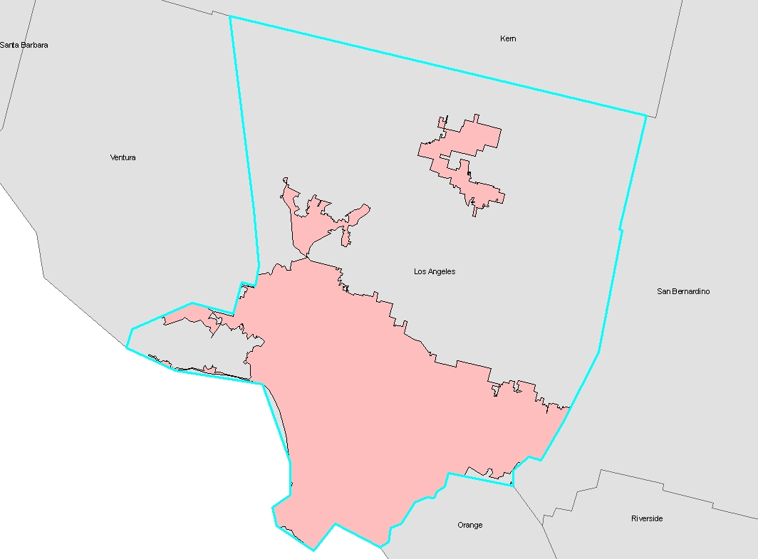
Wednesday, July 21, 2010

Spatial Analysis: Lab 5

1. There are 99 counties in the state of Iowa.

2.
In 2001, Fulton County had the largest population in the state of Georgia.

3.
In 2001 there were 39 cities with a population greater than 15,000 in Washington state.

4. The total length of the interstate highways that cross the boundary of Los Angeles County is 3851 miles (6198 kilometers).

5. Urban area within the boundary of Los Angeles County totals 1,367,445.9 acres (2136.6 square miles). See Figure 1.

Figure 1.

Pink shaded areas denote urbanized land.


6. There are 522 zip code areas with a centroid located within Los Angeles county's boundary.

7. Map of Canada displaying provinces only(Figure 2).


Figure 2. Oh Canada!

Question: How do you hypnotize a Canadian?

Answer: Slowly dangle a hockey puck in front of their face.


8.
The following First Nation Indian Reservations lie within seventy-five miles of Thurso, Quebec: Doncaster Indian Reserve 17, Kitigan Zibi Indian Reserve, Kahnawake Indian Reserve 14, Kanesatake Indian Reserve 16, and Akwesasne Indian Reserve 15. (See Figure 3.)


Figure 3. First Nation Reserves within 75 miles of Thurso, Quebec.

Sunday, July 18, 2010

Percentage Population of Select Racial Groups by County: United States in the Year 2000

The maps accompanying this text depict the population distribution of three select racial minority groups in the United States of America for the year 2000: African-American, Asian-American, and those who categorized themselves as ‘Some Other Race.’ The data for each group were mapped as a percentage of total population in each of the 3000+ U.S. counties. The data used in the creation of these maps were gathered by the U.S. Census Bureau for its A.D. 2000 general population census and accessed through their web portal at www.census.gov.

Data classes were chosen manually for each group’s data. My decisions in classifying the data were an attempt to highlight the distribution of data for each group, with an upper limit set at the highest value for a given data set. Looking at each map individually, certain patterns -- contemporary, historical, and geographical -- are evident.

Figure 1.

The strong influence of historical slavery is evident in the map depicting the U.S.’s African-American population (Figure 1). A concentrated population of this racial group is found in a broad swathe stretching from Mississippi to Virginia. In the nationwide list of counties ranked from greatest to least percentage population of African-Americans, a majority of the top one-hundred counties are located in Southern states: Louisiana, Mississippi, Alabama, Georgia, South Carolina, North Carolina and Virginia. Philadelphia County, contiguous with the city of Philadelphia in Pennsylvania -- the first county north of the Mason-Dixon Line on the list -- appears at #159, and even that’s a questionable entry. (Philadelphia has long been referred to in print as “that Southern city up north.”)

Mississippi is the state with the greatest concentration of African-Americans, specifically the Delta region in the state’s northwest. Out of a population of less than ten-thousand, Jefferson County in southwestern Mississippi had the highest percentage of African-Americans in the nation in 2000, or 86.5% of its population, whereas Webster County, West Virginia was the least Black county in the U.S. where a single African-American resided out of a total population of 9,719 souls, a percentage population of 0.0001%. Clearly the economics of slavery remains a strong determinate for the distribution of African-Americans across the nation.

Figure 2.

The distribution of Asian-Americans in the U.S. in 2000 shows a pattern strongly influenced by geographic situation, namely its position on an arc of the Pacific Rim (Figure 2). The other major factor is urban concentration and concentration around universities.

America’s West Coast states -- California, Oregon, and Washington -- are the locations of the greatest overall number of Asian-Americans in the contiguous U.S. And even within these states, the greatest percentage concentrations are found in regions with significant conurbations: the San Francisco Bay area, Los Angeles County (11.9%), San Diego County (8.9%), Multinomah County (Portland, Oregon) (5.7%) and King County (Seattle, Washington) (10.8%), though there are exceptions to this general rule (for example Solano and San Joaquin counties, located in California’s Central Valley, have sizeable Asian-American populations).

On the U.S. east coast, Asian-Americans are concentrated in urban areas, notably New York, Boston, and Washington, DC. Centre County, Pennsylvania stands out as the location of Penn State. Other urban areas around the country with significant Asian-American presence include Kings County, WA (Seattle), Denver, CO, Houston, TX, the Dallas/Fort Worth Metropolitan area, Atlanta, GA, Chicago, IL, and Minneapolis-St. Paul, MN.

The county with the highest percentage Asian-American population (46%) is Honolulu County, contiguous with Hawaii’s island Oahu (not depicted on the map). In the contiguous U.S., San Francisco County has the highest population of Asian-Americans (30.8%). The county with the least population of Asians in the U.S. is Monroe County, Kentucky where just one person out of 11,756 claims Asian heritage (0.000085%).

Figure 3.

The distribution of the population categorizing themselves as Some Other Race in the U.S. (i.e. persons choosing to be unspecific as to their racial category) is strikingly clustered along the U.S. border with Mexico (Figure 3). One can conclude that perhaps ‘Some Other Race’ is a euphemism for Latin American immigrants who -- for one motivation or another -- are disguising their identity from authorities. Interestingly, U.S. counties with the highest percentages of Some Other Race persons are those in east central New Mexico and Imperial County, California. Imperial County, one of California’s richest agricultural regions, has a high percentage population of immigrant labor who work in the fields. It is also a county where -- up to twenty miles from the actual borderline -- paved roads leading out of the county are fitted with border patrol checkpoints.

Saturday, July 10, 2010

Map projections and distance on Earth

The representation of Earth on a flat surface -- a map -- whether a sheet of paper or computer screen, inevitably results in distortion. A sphere or spheroid is the rough geometric equivalent of Earth; and the basic inequality of form between a sphere and a plane lies at the heart of this distortion. More precisely, distortion is a direct result of the mathematical transference of three-dimensional spherical coordinates onto a two-dimensional planar field, or, what is referred to as a projection (Christopherson 2006:25; G. & C. Merriam 1969:xxvi). While the spheroidal globe is near to a true representation of Earth, it’s limited by scale and presentation, i.e. only half of a globe is visible at any one time. Projections employed constructing large scale maps depicting relatively small areas in great detail, have less significance than projections employed for small scale maps depicting the entire Earth or a continent (Birdseye 1929:1; Alpha and Snyder 1982).

Numerous projections have been developed over the past two millennia (Snyder 1993:1) but the number of projections is potentially unlimited (Robinson 1960:66). Further, all projections preserve or display well one representational quality at the sacrifice of others. Such qualities include shape (form), area, distance, and direction (Greenhood 1964:114). Map projections preserving the shape or form of land masses are said to be conformal. (Less commonly these are referred to as orthomorphic projections (Greenhood 1964:115).) Map projections preserving the measured area of map features are said to be equal area, equivalent or homolographic maps (Greenhood 1964:115). Map projections preserving the distance between mapped features are said to be equidistant (Robinson 1960:58). Maps projections preserving the direction between mapped features from a central point of tangency are described as azimuthal (Robinson 1960:59). Due to widespread misconceptions about Earth engendered by the use of some projections, geographers and cartographers have at times advocated the discontinuation and use of certain categories of map projection (Committee on Map Projections 1989:222).

To illustrate the variation of distance as it is represented by maps made using different projections, six world maps were constructed in ESRI’s ArcMap program using six projections: two of the maps were made using a conformal map projection; two were made using an equal area map projection; two were made using an equidistant map projection. Conformal projections used were the Mercator and Gall Stereographic (Figure 1); equal area projections used were Goode’s Homolosine and Bonne (Figure 2); equidistant projections employed were the Sinusoidal and Equidistant Conic (Figure 3).


Figure 1.

Following construction of the six maps in ArcMap, I employed ArcMap’s digital measuring tool to measure the distance between two select cites located on different continents: Washington, DC (38° 53' 42" N, 77° 02' 12" W) and Kabul, Afghanistan (34° 31' 00" N, 69° 10' 59" E). The correct measured distance between Washington, DC and Kabul, Afghanistan is approximately 6919 miles (Travel Distance Calculator Between Cities 2010). The results of measuring the distance between the two world cities are listed below in Table 1.

No map shows scale correctly across its entire area. In addition to area and shape, map scale also distorts in parts of a map other than its point or line of tangency (Snyder 1982: 6). This feature is the reason distance on the various projections employed for this exercise is so varied. Mercator projection maps of the world represent equatorial regions well, but they’re greatly distorted toward the poles, a condition that’s the result of representing the poles (points) as lines equivalent in length to the equator (Alpha and Snyder 1982).


Figure 2.

A stereographic projection exaggerates area. Representation of area -- and by extension scale -- increases from the map’s central point of tangency (Robinson 1960:82). Goode’s homolosine -- an interrupted projection utilizing several standard meridians -- combines elements of homolographic (nee equal-area) and sinusoidal projections with variable scale across the map (Snyder 1982:221). Scale on both sinusoidal projections and the heart-shaped Bonne projection are true only along their central meridian and parallels (Snyder 1993: 50, 62), whereas scale on an Equidistant Conic projection map is true only along meridians (Snyder 1993:122).


Figure 3.

Although none of the six projection’s Washington-to-Kabul measurement was correct, these inaccuracies may be due to coarse resolution of each map and the limitations of precision in the ArcMap measuring tool.


Table 1. Projection category, type of projection and measured distance in miles between Washington DC and Kabul, Afghanistan using six separate projections.

Conformal maps:
Mercator projection 10,119
Gall Stereographic projection 7,135

Equal Area maps:
Goode’s Homolosine projection 9,986
Bonne projection 6,753

Equidistant maps:
Sinusoidal projection 8,103
Equidistant Conic projection 6,975


Analog comparison


As a comparison, I measured the distance between Washington and Kabul using an old analog method. The tools required are a globe and a string. The measurement is simple as follows:

STEP 1. Stretch a length of string on the globe from Washington, DC to Kabul, Afghanistan as close as is practicable approximating the path along a great circle (Figure 4).


Figure 4.


STEP 2. Removing the string from the two points of the measurement, placing one end of the string at 0° lat, 0° lon, stretching it along the equator to obtain its length in degrees of longitude (Figure 5).

Figure 5.


STEP 3. Multiply the number of degrees measured by 69 miles.

For this operation, the distance the string stretched along the equator was approximately 100° of longitude. Multiplying 100 by the distance between 1° along a great circle (69 miles), the distance between Washington, DC and Kabul, Afghanistan is about 6900 miles (100 X 69 = 6900). This measurement is closer to the actual value between the two cities (6919 miles) than the measurement obtained from any of the projected maps, illustrating the dictum that the globe remains the truest representation of Earth.

ADDENDUM:

Of course, none of these provide the real method by which one would obtain the shortest distance to Kabul from Washington. For that there are these three steps:

(1) Have the CIA secretly train and arm thousands of Afghan fundamentalist jihadists (including Osama bin Laden) to defeat an occupying army of Russians during the 1980s.

(2) Allow the remnants of these jihadists to evolve into the ultra fundamentalist Taliban government during the 1990s.

(3) Feign surprise when these products of CIA training provide haven for terrorists with a deep abiding hatred for the products of U.S. foreign policy.

Follow these fool-proof steps and you’ll be in Kabul in no time.

Peace.

References

Alpha, Tau Rho and John P. Snyder 1982. The Properties and Uses of Selected Map Projections. Miscellaneous Investigations Map I-1402, United States Geological Survey. United States Government Printing Office, Washington, DC.

Birdseye, C. H. 1929. Formulas and Tables for the Construction of Polyconic Projections. Bulletin 809, United States Geological Survey. United States Government Printing Office, Washington, DC.

Christopherson, Robert W. 2006 Geosystems: An Introduction to Geography, Sixth Edition. Pearson/Prentice Hall, Upper Saddle River, New Jersey.

Committee on Map Projections, American Cartographic Association 1989 'Geographers and Cartographers Urge End to Popular Use of Rectangular Maps'. The American Cartographer. Vol 16, No. 3, pp. 222-223.

Greenhood, David 1964. Mapping. The University of Chicago Press, Chicago, IL

Merriam, G. & C. Co. 1969. Webster's Geographical Dictionary. G. & C. Mirriam Co., Springfield, MA

Robinson, Arthur H. 1960. Elements of Cartography, 2nd Edition. John Wiley and Sons, New York.

Snyder, John P. 1982. Map Projections Used by the U.S. Geological Survey. Bulletin 1532, United States Geological Survey. United States Government Printing Office, Washington, DC.

Snyder, John P. 1993. Flattening the Earth: Two Thousand Years of Map Projections. The University of Chicago Press, Chicago, IL

TRAVEL DISTANCE CALCULATOR BETWEEN CITIES www.mapcrow.info. Data retrieved 7 July 2010.

Tuesday, July 6, 2010

Introduction to ArcMap: Exercise 2b

Potential of GIS

ArcMap is a complex program capable of displaying information in near-infinite variants. This is obvious. Of course, one is limited to the availability of data -- both shapefile data and geocoded data -- and one's ability to effectively use and navigate the program.

As a tool for the arrangement of map elements and arranging completed maps on a larger template (as was done in the exercise), ArcMap is clearly effective and facile.

Pitfalls of GIS

First time ArcMap users are at a disadvantage using the program in which inattention to a mouse click can change the onscreen display to such a degree that one's previous work can be lost or seemingly so. I look forward to further use of the program gaining familiarity with it, in order to minimize these anxieties.

Proposed Airport Expansion Map


Monday, July 5, 2010

Discussion: My Google Map Experience

Creating a personal map using the Google Map interface was interesting and fun, but also frustrating. Perhaps due to my age, I still consider paper topographic maps as my primary source for evaluating geographic data. Though digital sources have their positive points -- ease of access; seamless coverage -- my experience with digital-source maps has shown that, while convenient, they can be incomplete and limited sources of geographic information. Of course, this is the case with any map or representation of Earth: no representation is perfect or complete. But, within my own interior digital/analog debate, as I see it, there are peculiar and particular aspects of the comparison between these cartographic forms which remain to be explored and examined.

Frequently, when comparing a topographic quadrangle depicting a given area (i.e. an actual large-scale paper map) with its digital counterpart, features depicted on the quadrangle are missing from on-line digital sources. Such features include nominal information (the names of mountain ranges, streams and villages, for example) and the depiction of various categories of features. The location of springs, for example, is missing from most of the commonly-used digital map sources such as Google Maps or Google Earth.

Conversely, on occasion, I've come upon information from digital sources which are not depicted on the corresponding topographic sheet. This was the case some months ago while planning a trip to a remote part of the Mojave Desert. Cross-referencing with a topographic quadrangle, Google Maps depicted an entire network of named roads where none were shown on paper. (Many topographic sheets are outdated and their depiction of roads can be a source of confusion.)

Another aspect of the paper vs. digital conundrum is perhaps somewhat personal and idiosyncratic: the seamless, regular coverage of a digital map (such as Google Maps) contrasts with the sense of suspense and anticipation accompanying the first view of a large-scale topographic quadrangle. This experience -- part surprise, part exploration -- has no equivalent in the digitally-represented world in which all locations, areas, and landscapes, merge from one to the other without interruption or circumcision.

Lastly, the large size of a paper topographic sheet -- compared to the size of the average computer screen -- allows greater freedom when scanning an area: relationships between features over broad areas are cognitively accessible; patterns easily discernable. With a computer screen, such relationships are masked or, at least, access to them is limited, i.e. mousing around a digital map, one part of the map will recede off-screen as another part comes into view. Also, as with all representations of Earth, the vagaries of scale account for coarseness of resolution with respect to the quality of viewable data.

My Google Maps dynamic map titled 'Science, Nature, Adventure: hiking in the Lava Mountains, Mojave Desert, California' depicts a part of an adventure undertaken 14 February 2009 to the Lava Mountains in the Mojave Desert portion of San Bernardino County, California, USA. The object of the “adventure” was to visit -- in their natural setting -- Indian (i.e. Native American) rock art at Steam Wells, an abandoned settlement once occupied by an apparent recluse. I was unaware of this capability in the Google Maps interface. Creating a Google Map was new to me.

My own view of online mapping services such as Google Maps or MapQuest is that they primarily serve as vehicles of commerce, a perception based on my user experience. Frequently the only nominal features appearing on such online mapping displays are businesses, and of those, only businesses who have paid to appear on the map. Such a situation edits automatically a great deal of information. With commerce as a constructive limit for what does and does not get mapped, businesses which may be superior in some way (i.e. restaurants better than the ones which have paid to appear on the map) are left out of the representation. Excising information that cannot be priced, the map is less rich and its users impoverished. The value of online user-generated mapping lies in circumventing such commerical strictures, though one is limited by what the interface will allow and the skill set of the user.

Though not a luddite by any means, using digital mapping services like Google maps is fun, but I wonder about its ultimate value. When the cables at the bottom of the ocean were finally connected, the first user of the trans-Atlantic telephone lines commented "What should I say?" And so it is as each new technology is sold to the public: all too often, the medium becomes its own raison d'etre; and content secondary.